This is an absolutely fantastic book about the history and practice of typography. I love it so much this is the second copy I’ve purchased so I can have one at home and one in my office at work. It is well-written, fascinating, well-researched, and offers deep insights into improving the typography and readability of any document you create.
Using the techniques outlined in this book I have been able to create professional documents that are more persuasive in a business setting because they look nice and are easy to read. After reading this book you will begin to notice the impact of typography all around you and take notice of how you can make better documents.
Download the free Kindle app and start reading Kindle books instantly on your smartphone, tablet, or computer - no Kindle device required.
Read instantly on your browser with Kindle for Web.
Using your mobile phone camera - scan the code below and download the Kindle app.

Follow the author
Something went wrong. Please try your request again later.

Book recommendations, author interviews, editors' picks, and more. Read it now.
Frequently purchased items with fast delivery
Page 1 of 1 Start over
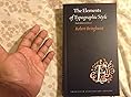
- The Elements of Typographic StylePaperbackFREE ShippingGet it Nov 10 - 17Only 1 left in stock - order soon.
- Designing with Type, 5th Edition: The Essential Guide to TypographyPaperbackFREE Shipping on orders over $35 shipped by AmazonGet it as soon as Saturday, Nov 8
- The Elements of Style:Fourth Original Edition(Annotated)William Strunk Jr.PaperbackFREE Shipping on orders over $35 shipped by AmazonGet it as soon as Saturday, Nov 8
- Universal Principles of Typography: 100 Key Concepts for Choosing and Using Type (Rockport Universal)HardcoverFREE ShippingGet it Nov 12 - 17Only 6 left in stock - order soon.
About the author

They call it "Elements" for a good reason.
This book is really informative for those getting into the typographic business, demonstrating good ettiquette in the myriad niceties involved (even in the matter of page size and layout). There's also a handy index for extended characters for type designers, especially the Cyrillic italics which can be obtuse for those used to Latin regularity. The only downside is that it's a bit dated in the face of new font technology. Otherwise, definitely a must-have for graphic designers!
Top reviews from the United States
There was a problem filtering reviews. Please reload the page.
- Reviewed in the United States on August 23, 2018Format: PaperbackVerified Purchase
 This book is really informative for those getting into the typographic business, demonstrating good ettiquette in the myriad niceties involved (even in the matter of page size and layout). There's also a handy index for extended characters for type designers, especially the Cyrillic italics which can be obtuse for those used to Latin regularity. The only downside is that it's a bit dated in the face of new font technology. Otherwise, definitely a must-have for graphic designers!
They call it "Elements" for a good reason.
Reviewed in the United States on August 23, 2018
Images in this review


Top reviews from other countries
- M SchulzReviewed in the United Kingdom on December 4, 2024
Stunning.
Format: PaperbackVerified Purchase
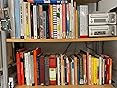
By far the best book on typography I have seen or own. (And I own two shelves full.)M SchulzStunning.
Reviewed in the United Kingdom on December 4, 2024
Images in this review

-
NicolòReviewed in Italy on February 7, 2021
La bibbia della tipografia
Format: PaperbackVerified Purchase - Amazon CustomerReviewed in India on December 30, 2018
Not for the faint hearted (in terms of typography)
Format: PaperbackVerified Purchase -
JannikReviewed in Germany on March 28, 2013
Wunderschönes Buch, viel fundiertes WIssen
Format: PaperbackVerified Purchase - Martin KrzywinskiReviewed in Canada on December 25, 2020
The only typography book you need.
Format: PaperbackVerified Purchase